
Nothing can compare to the power of paint and its impact on the ambiance of a space — for better or worse. Exploring paint colors can be exhausting and nerve-wracking, even for the design-lover in all of us. We all know that feeling of anxiously waiting for the walls to be covered after finally committing to the “perfect” hue.
I’ve even had my fair share of hoping and praying to the paint gods during the early days of my design business. After decades of exploring endless swatches and experimenting, I’ve come to know exactly how certain paint colors breathe new life into a room, and how others just don’t cut it. That’s why I’m particularly excited to share my designer guide to selecting paint colors with you.
Alright, let’s talk paint, shall we?

Cool vs Warm Tones
First things first: tone matters. While warm colors are certainly on the rise, both cool and warm tones should always be considered, as each have their own unique impact on the mood of the space.
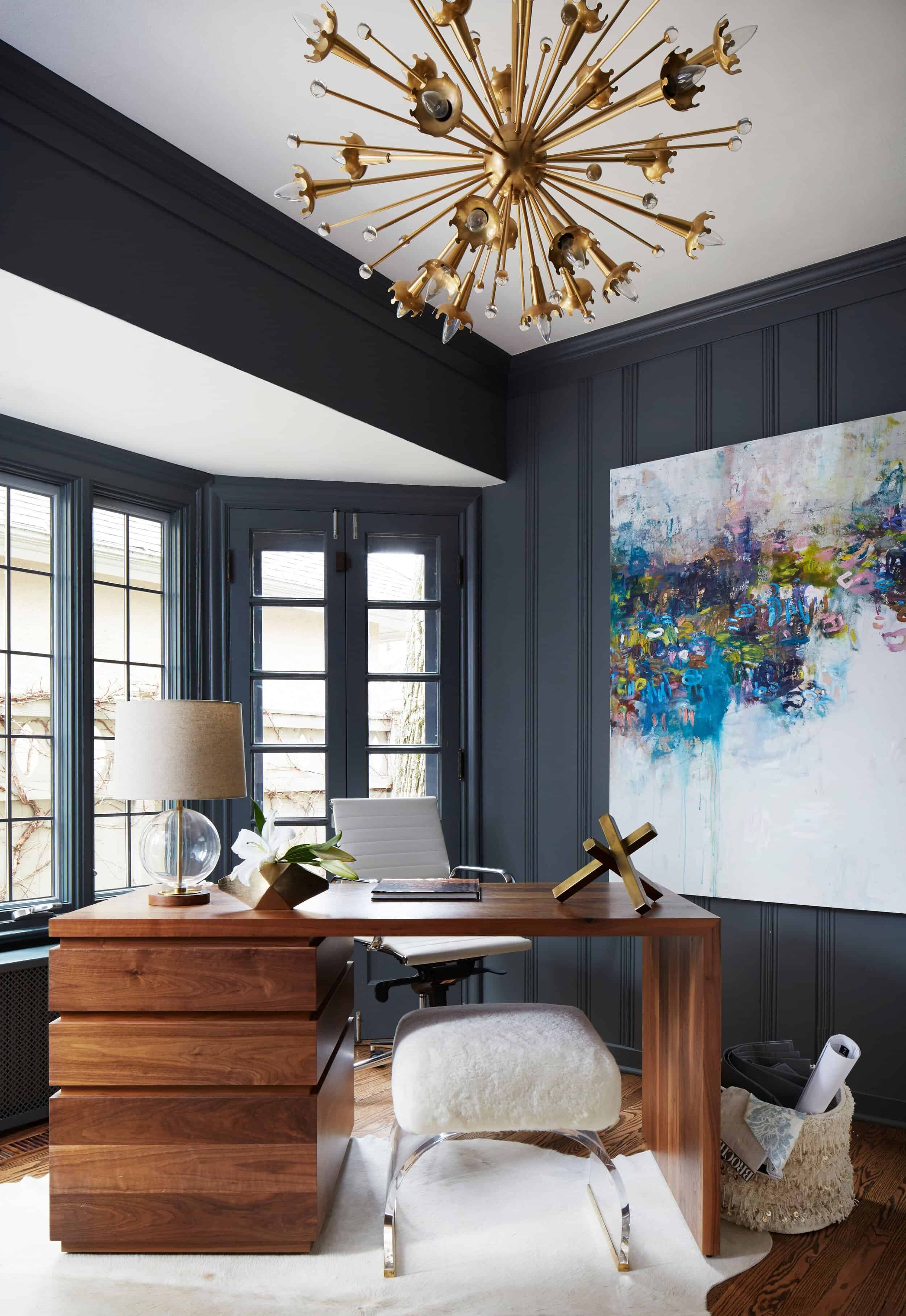
Typically, warm tones are more stimulating and cool tones are a bit more calming. I lean towards incorporating cool tones in bedrooms or offices where tranquility, concentration and rest are important. Warm tones make a really inviting impact in the social rooms of your home, like the family room, dining room or kitchen.
To achieve a beautifully balanced space, rather than silo the two tones, I suggest mixing warm and cool together for a little variety. Too many cool tones can make a room feel cold and unfriendly, while too many warm colors can make a place feel stuffy or dull. For example, grounding a room in a soft blue paint color, and balancing it with yellow-toned beiges and rich woods can result in a more balanced design.
Neutrals vs. Bright Colors
Do you ever have an internal battle between your love of neutral vs. bright colors? You’re not alone, and I assure you, there is a place for both.
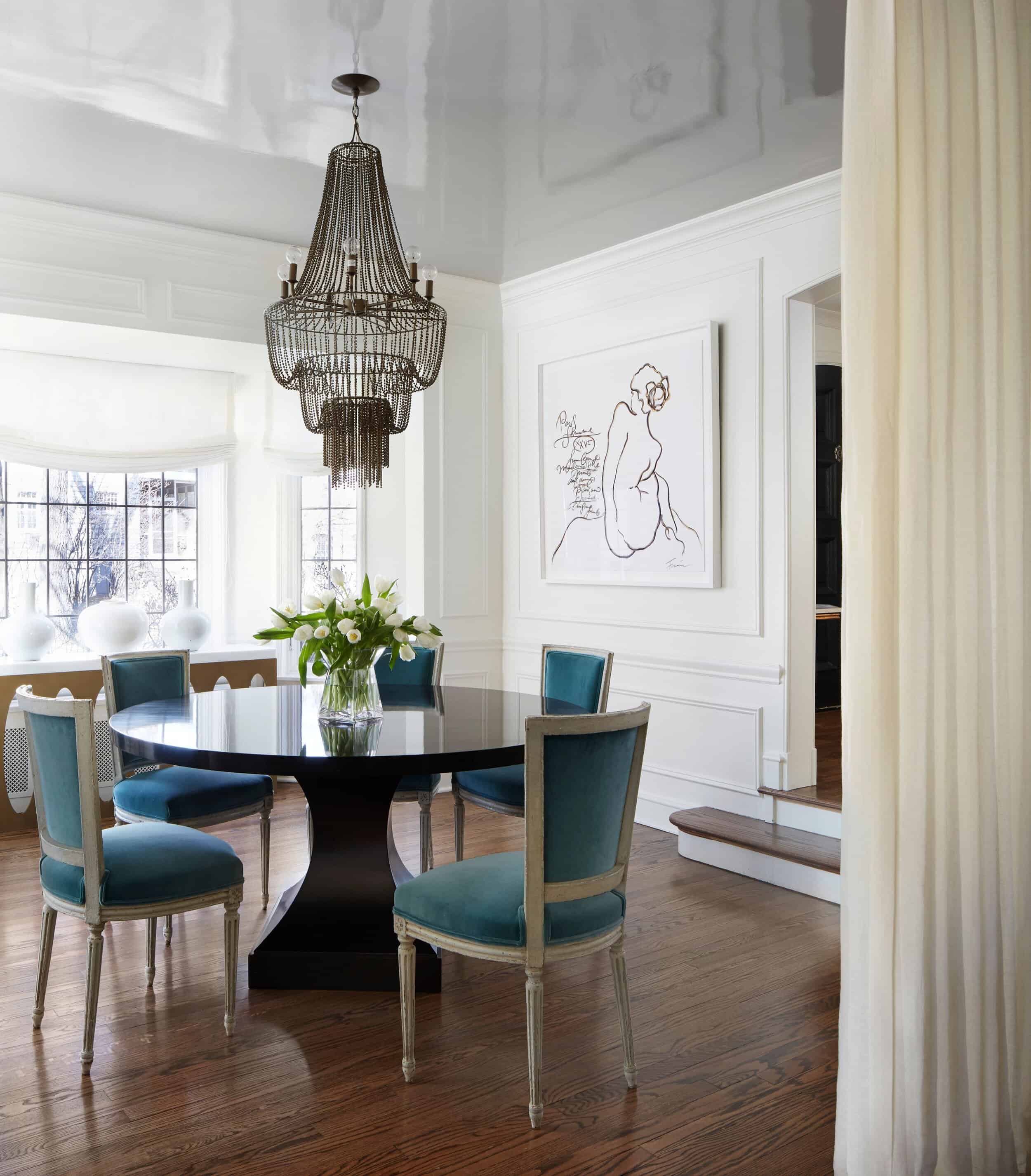
I always lean towards neutrals in larger spaces which then allows the furniture, art and decor to pop with color. Keeping large spaces grounded in a timeless neutral base will prevent it from feeling overstimulating.
Smaller rooms are perfect for going a bit bolder with your paint choice. Think: butler pantries, powder rooms, home offices and mudrooms. Don’t be afraid to play with color and infuse these small but mighty spaces with your personality.

My Go-Tos
Now onto the specifics… After testing an endless range of colors, I’ve found a few that I gravitate towards time and time again:
Neutrals:
-
Simply White (Benjamin Moore)
-
Wimborne White (Farrow & Ball)
-
Cornforth White (Farrow & Ball)
-
Graytint (Benjamin Moore)
-
Edgecomb Gray (Benjamin Moore)
Brighter, Bolder Colors:
-
Hague Blue (Farrow & Ball)
-
Hale Navy (Benjamin Moore)
-
Downpipe (Farrow & Ball)
-
Black Satin (Benjamin Moore)
-
Wolf Gray (Benjamin Moore)
-
Stifkey Blue (Farrow & Ball)
Deciding on a Paint Finish
Once you have your color selected, it’s time to think about the finish.
For the walls themselves, I love a soft, matte finish. It does a wonderful job of hiding any life-induced knicks and scratches from kids, pets, or a close-your-eyes and hold-your-breath accident — and matte is much easier to touch up than glossier finishes. I not only love it for its practicality, I also love the rich, velvety look it brings to your walls. Pair it with a beautiful pop of art and you really can’t go wrong.
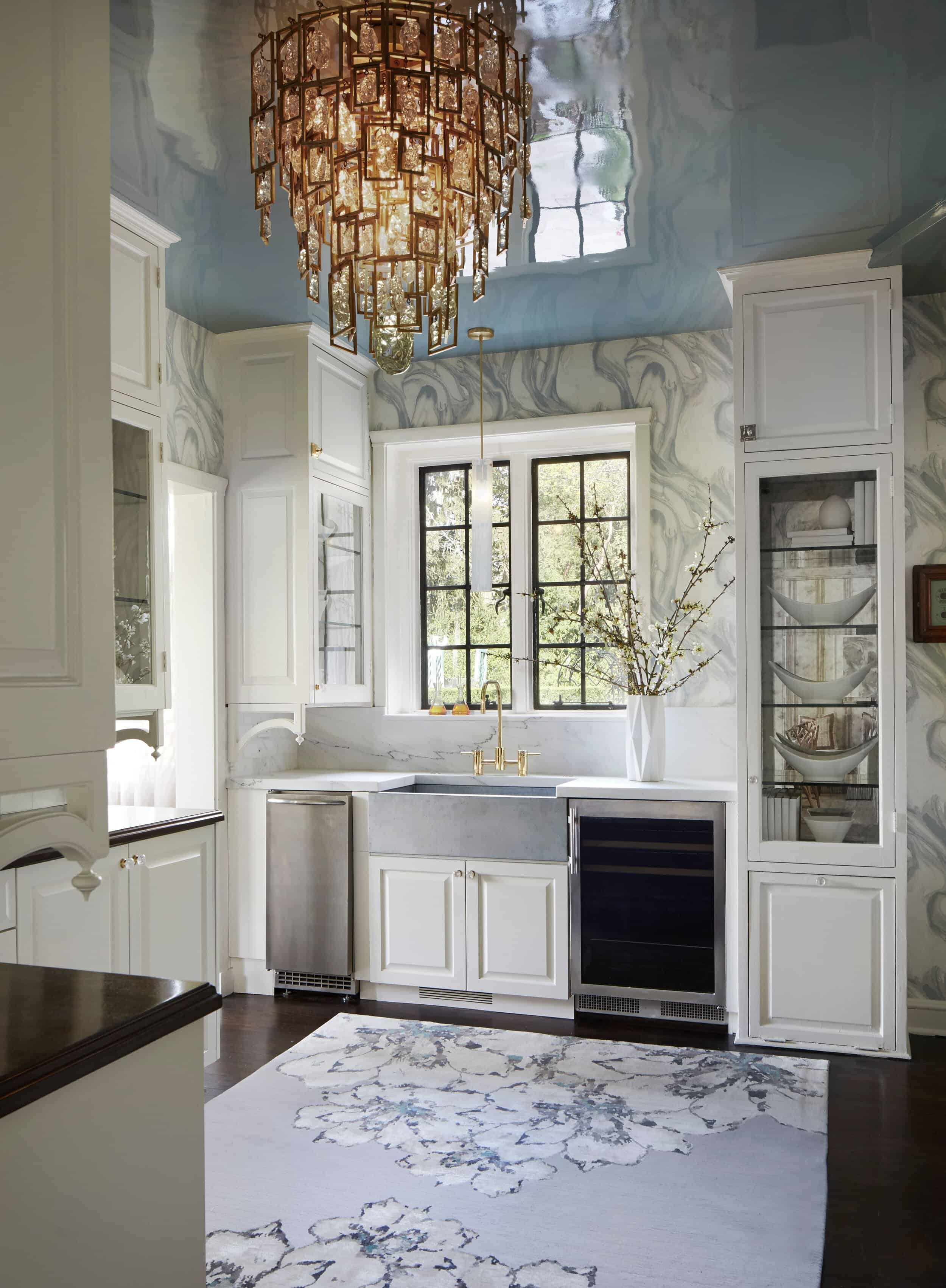
All of this isn’t to say a glossier finish doesn’t have its place; for me, that’s on the ceiling.
One of my favorite ways to play with finishes is to lacquer a ceiling. Since lacquer can chip, I believe it was made for up top, providing a major “wow” factor for any room. I won’t sugarcoat it, though; the process of lacquering a ceiling is quite labor-intensive. But you can’t argue how truly gorgeous the dewy, reflective surface is and what it brings to a space.
If you love the lacquered look, and want to incorporate it somewhere other than a ceiling, try using a super high-gloss paint that is far less chippable. You’ll still get that luxurious, sophisticated high-sheen finish, while ensuring durability.
Wall, Trim and Ceiling Choices
All of that talk of ceilings leads me to my next tip: always give ample love to the ceiling and trim, too. While the walls definitely make the largest, most obvious impact, beauty is always in the details. Consider the color of your ceiling and trim while making your wall paint selection to ensure harmony across color and finishes.
One of my favorite ways to paint a room is by leaning into the monochromatic look: tie together the walls, ceiling and trim with one base color, but then add some dimension through the finishes. This painting technique really opens up the space, allowing your eye to move around without any stopping points, and inherently directs the attention towards the objects in the space. Keep in mind, having some variation in finishes also adds a unique design touch. For example, I would use matte on the walls and ceiling, but satin on the trim.
Most Common Paint Selection Mistake
Last but most certainly not least, if I can only offer you one piece of paint selection advice, it’s this: test your paint in every type of lighting. Colors can vary drastically across different lighting.
Bright natural light will show the paint color in its truest form, while various versions of layered lighting might bring out other hues.
Order a few large paint swatches, tape them on the walls and look at them throughout the day to make sure you love the color from sunrise to sunset, during the brightest part of the day, and while unwinding by candlelight.
This is such an insightful article. Thanks for sharing!